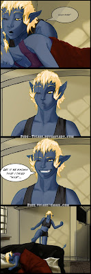
Remember boys 'n girls. When working on anything, do flat colors first and then finish the background second! After which, you go and hue the flats on the characters to match the tone of the background. Finishing the characters first with all their shadows and highlights does you no favors when their colors don't match the background at all. Altho I know this fact since before I started the next comic, I still failed to implement it, so my bad. I will be doing that in the future though. The reason I skipped that step and did the background last was because I'm lazy and never really done backgrounds with any proficiency at all. That will all change, hopefully, the more I do these comics. Oh heck, that was the tease, let me show you the whole thing since it's already done and I have it. Think of it as privy to those of you whom bother to watch this blog. Special you guys, huh? Huh!? Yeah, don't that feel special? I'll post the comic tomorrow on devart, provided I don't keep going back and change it some more.
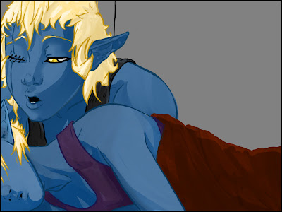
 Now lets compare notes, shall we? This is certainly a different style than what I had before. I, personally, am really digging it. But there are a few things I'd like to bring over from the older style of the comic as well, namely the deeper use of blacks and shades and darker eyes as well.
You see? I really liked the way this first comic came out but this one was done in Open Canvas. The second one was done in Photoshop, after I discovered the cool effects I can add to my brushes. It mimics almost what I can do in OC but good enough that I want to use it with more proficiency. And hopefully expand my color pallet as well. I'd like to try different ranges of colors in the shading of my drawings outside of the flat "darker tone of the same color".
Alright, I babbled on enough about that. Now about what the strip is about. Shade is Shadow's older sister and who is, quite honestly, a bitch. She actually deeply loves Shadow as her sister but can be very very cruel to her. It's a love/hate thing. Over the course of these comics she'll call her sister all sorts of nicknames, and "sissy" is the first of many.
Hope you enjoy guys and don't be shy about comments! If you like, share this blog with more folk. The more who watch it, the more I'll do in here. I'll be sharing lots of stuff and junk in here, more so if I get my connection back in my room.

4 comments:
:D ditto on getting flat colors down first. I have fallen victim to not doing this and regretting it later on.
I do most of my pencil work in sketchbook pro as i feel it gives me more pressure sensitivity. As for color i have yet to try using photoshop and painter x. That being said i really like the gray tones as well it has a very retro vibe. :D Great stuff man looking forward to more. Oh and great stuff on that street fighter forum, lots of cool takes on the sf characters. :D
@ TH3DEN
Cool dude. Glad I'm not the only one to fall prey to the trappings of forgetfulness.
I keep hearing about this Sketchbook pro and it's getting me curious. The lines I do in PS is fine but it keeps sounding like sketchbook pro is the way to go for linearts.
Photoshop can and will surprise you with it's versitility once you take the time to play with it. There are alot of options that they give you but you need to either learn it with a tutorial or with trial and error.
Oh and thanks dude! I love me some SF and need to do even more of 'em. But I'm part of the SFmag now so I'm doing alot of SF drawings for the comic part, haha.
You should try it :). Specially since you have a cintiq, it'll work great. If you have msn I can send you the file.
Yeah I think I'm just intimidated by Photoshop. I'll eventualy get into it as I'm feeling like taking my coloring a bit more seriously. I think I have exhausted sketchbook for coloring as it's fairly limited. :)
I have an MSN e-mail address but haven't used my screen name in forever. Would you care to try 'n send it to my g-mail? It would be most appreciative dude! fire.tisane@gmail.com
I was the same way at first. I would only color on other layers set to multiply over the linearts but after I learned a few tricks, like how to lift just the lines off of the background on a new layer, I became bolder in my approach. It's really more getting used to the layout it has as a default, finding out what you use the most, and readjusting yourself and make photoshop more accommodating for you. The stuff I'm having the most fun with right now is Pixel Lock on the layers and comboing that with the lasso tool and gradient fill. Pixel lock just effects the pixels that are on that layer and not anything transparent. Great for cell shading work and anything else that you want to have a clean look with. What I really want to play with next is using gray tones and then setting another layer to colorize and multiply ect. to make it stand out more. The effects that can have is amazing. Using that method gives you the Akiman look that Kandoken has over on SRK.
Post a Comment